Friday, September 2, 2011

The Living Room

This was the room that sold me! I think it was because it is a room that I had seen in hundreds of old films. That being said, I also knew that we had our work cut out for us.


As I stated before this room was painted a cool, sage green. When we had our second "walk through"  before purchasing the house, I was convinced there was either water damage  or paint failure in here. Turns out that sometime in the 1950's a previous owner had the fantastic moldings put on the walls, OVER fabric based wallpaper. Over the years, the fabric paper and moldings had been painted, many times. I loved the frames of molding on the walls but couldn't remove the moldings,to strip the fabric wall papers, without destroying them. I decided to take a razor and cut around the moldings and then my daughter and I were able to catch a corner of the fabric paper and just pull it all off. When we were done I used painters caulk to seal all the edges of the moldings before painting them.

I believe that prior to the 50's makeover the living room walls had never been painted and were always covered in wallpaper. We even found written notes and patched plaster where wall sconces once were (we found the original sconces in the attic). Once completely stripped, the walls were the original plaster which meant they needed to be filled, sanded and primed before we could put any color on the them. So much for the  "I'll have this done in a Jiffy theory" 

TIP: My favorite primer is Glidden "Gripper". I use it on EVERYTHING, you'll see when I get to the kitchen


Before


After

  The fireplace was not without it's issues! If you look at the before picture it looks as if the mirrors are small panels. WRONG! That is one big, heavy mirror. So heavy that it's weight had pulled the beautiful mantel about 3 /4" from the wall.  Somewhere in time a "handyman" filled the space between the wall and mantel with string and painters caulk, smoothed it over and painted over the whole thing. When they installed the mirror they somehow created a channel in the crown molding and the mantel and slid the mirror in. So once the mirror was down, the walls stripped, the caulking cleaned up we realized that we had to completely replace the drywall and that the molding was not going to match. This is where I did a little "Color Magic"
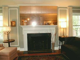
 
Before
 
After

 
When I told my husband I was thinking of painting this room gold he nearly ran from the room screaming. Gold is tricky (ask my sister-in-law that painted one room 4+ times in colors ranging from scary clown make-up to finally a beautiful squash color), but I think it really works here. Actually the color is Stable Straw which I think is hilarious considering it is a "formal" room. This color compliments the newly refinished floors and more importantly, I can choose various shades of gold and they all seem to match. So what "Color Magic" did I do over the mantel? By painting the crown molding and the mantel wall the same darker shade of gold the imperfections of that molding are barely noticeable. It also creates a nice feature wall for the wonderful pastel that ties all the rooms colors together by artist Kath Schifano (http://kschifano.com/)


Before

After
In this corner I have grouped two antique prints that my mother gave me. Years ago I had them reframed and even though they are matted in mauve the black frames work with the black accents in the room and the florals tie in with the rest of the colors. I also chose to paint the mantel, baseboards and bookshelves the same creamy white that is used through out the house. The shelves are filled with books on art, framed art, glasswares and even my grandmothers hobnail, milk glass. I was surprised at how pretty the white milk glass and white shelves look.


The French doors lead to a screened porch, where we virtually live in the summer.In the winter I have to cover them with lined matching drapes, as we store all of our outdoor furniture on the porch.


Before

After

The red sofas are really a modern design that I had seen several times in catalogs but modern print fabrics and thought "not traditional enough". Then we saw one in a solid ultra-suede at a furniture store and I was sold. They have just enough camel back to feel traditional but the fabric and chunky square legs are made for family living. It is awesome to curl up on them in the winter, with the fire lit and read a good book.


Before


After


Before
  
After


Colors, Textures and Patterns just seemed to come together in here. I had not been one to mix patterns but in this room I was able to do it very successfully. Once we found the sofas with the coordinating gold and red pillows I searched long and hard for the perfect chair . When I found it. I had several choices for fabric but this pale yellow brocade with the darker gold and red floral swirl just seemed to be the perfect match. All the colors work together and create a place where are whole family likes to congregate.

 
Carpet

 
Window Treatments


Sunday, August 28, 2011

The Foyer, Entrance Hall and Stairs

Well after stripping the final layers of glue off the stairs to the third floor, for 4 hours yesterday, I decided to skip a day! So here it is, I am finally getting down to the business of design choices. I'm thinking the easiest way to do this is to just walk you through the "before and afters" of our restoration and let you know the "hows and whys" of my choices.

While I worry that the word Restoration could make this blog seem a bit snooty, I want you all to know that ultimately my disign style is all about color, comfort and affordablity! That is one of the reasons I want to write this blog. I want everyone to know you can create a beautiful environment for yourself, inexpensively, but you have to be patient and wait for that right piece of furniture, rug, color, etc. to speak to you. Most things in our home where purchased off line, at discount clubs, in big box stores, at garage sales or given to us, second hand.
Dare yourself to come up with a design plan and have fun watching it come to life.

Our foyer all is all of 4'x5' and when we moved in it was completely covered with an oriental, foiled wall paper (even the sliding doors to the minute closet). As a Mother's Day gift my daughter, 12 years old at the time, started stripping the paper for me. It was another 3 months before we could change the small sliding doors on the closet to bifolds. NOW, I am by no stretch of the imagination a fan of bifolds but sometimes you just don't have a choice. This closet was built some time in the 1960's and as there are no other closets on the first floor; it was not something we could demo. So in picking a bifold we tried to find a wooden one with panels that would fit in. It was then another 2 months before I got around to painting and rewallpapering!

Our Foyer, Entrance Hall, Stairs and Second Floor Hall colors were all inspired by the stairs. The black and white stairs where a jumping off point for me. Even before we moved in, I envisioned these stairs covered with an oriental runner in a rich black, taupe and gold colors.

This made choosing the wallpaper a snap for the foyer. A very traditional black and taupe stripe to add height to this tiny space. The only thing we saved in this space was the wonderful light fixture!


I love these black handles.
By placing them in the center of the bifold doors 
a viewer could think these are regular doors that open out.
They are also large enough to be knocked around in this high traffic area.


When we moved in, the livingroom, dinningroom, entrance hall, stairs and secondfloor hall were all painted the same sage green with cream trim. The shade of green had a grey hue and made the space feel too cool.  Now, just the entrance hall, stairs and second floor hall are a warm shade of taupe with cream trim, black accents and oriental carpets.

 
Before


After

As a lover of the arts it would have been great to be able to afford several large pieces of art for the stairs. Facing many more restoration projects in the house I chose to group black and white photos of our family in black picture frames. I placed the groups as if placing a larger piece of artwork and they fill the wall nicely.

Before
After
We were lucky enough to be in the house, working, several days before we moved in and we were able to have the floors refinished. The floors are beautiful Arkansas Red Oak and once refinished many people asked if we had new floors laid. You can see the difference in color here. The original light fixture in this entrance hall was very small and hung to low for all the men on our family.  I was able to find this pendant at Lowe's that had a much better scale to the space and was at leat 2" shorter that the orginal. The shape, finish and etched glass make a much better statement about our style and the stle of our home. I also found an octagonal oriental rug (the shape mirroring the light fixture) with colors that not only relate to the stairs but also to the adjoining living and dinning room.


That's it for today! Looking forward to sharing more!


Friday, August 26, 2011

Don't Want to Skip a Day!

So really quick! I don't want to skip a day! Best birthday present- Barbra Streisand's "My Passion for Design". First "Coffee Table" book I ever actually read. INSPIRING and just what I would do if I had her money. If you can get your hands on a copy, READ IT, even the photo captions. Love this book.

Thursday, August 25, 2011

Why "Renovation or Restoration?"

Let's start at the beginning! After years of convincing my husband that "New Builds" just don't hold up, we bought a beautiful Center Entrance Colonial. It was 70 years old when we bought it, 5 years ago, and with the exception of our 1980's "Dental Office" Kitchen (more on that in the future) it had not been updated for 40 years. Having a BS in Interior Design and a MAH in Art History and Theatre Design I was adamant that we would not just rush into this house, GUT, and Renovate/Update. So my mantra (and soon my husband's too) was "Restoration, NOT Renovation". And so the title!

There will soon be rantings about my 1980's kitchen and design shows that put modern furnishings in traditional settings and call it "Eclectic" or "Transitional".

My idea: pick a style, do your homework and enjoy!

I was thinking that the best barometer for a well designed room is "Would I like to hunker down in this room, read a good book , drink a great glass of wine and listen to some awesome jazz here." If I would like to do that in the room, and still stop to look at the beautiful colors, fabrics, textures, accessories, etc. in the room, then THAT is a room I want in my home.

Wednesday, August 24, 2011

A Little More Info

So late last night I took the plunge. Today I added a little more info. I'm hoping to show case all the crazy before and after pics from the last five years of renovating our house. I would also LOVE it if any of you have any questions for me about design or color choices in your houses. For those of you that know me I am ever the teacher and ALWAYS one with an opinion. Think I can have fun with this and hopefully teach someone a thing or two about color.

Tuesday, August 23, 2011

The beginning!

So here I am writing my first blog, Feeling a bit "Julie and Julia". Looking for a way to help folks be inspired by Design and the Arts. If anyone reads this tonight I will be shocked. I really don't have a clue as to how to do this and I think my page will probably look pathetic. So for now be patient with me and the first of my designs will be my Blog Page! Wish me luck!